
How To Read A Candlestick Chart

What is a candlestick chart in Forex?
A candlestick chart is a type of chart, as well as a technical tool, used to identify trading patterns in a currency pair. The chart is represented by rectangle blocks with vertical lines at the top and the bottom, resembling a candle and its wick. Each ‘candle’ represents the opening and close prices of a currency pair, while the ‘wick’ represents the intraday highs and lows. A candlestick chart is one of the easiest ways to follow price movements in Forex and identify a trend (i.e. upward or downward trend). Candlestick charts are an option for traders using MetaTrader 4 (MT4) and MetaTrader 5 (MT5). They are easy to enable through the main toolbar, main menu and a keyboard shortcut and are the most popular option among MT4 traders when it comes to recognising the market trends.
Understanding candlestick charts signals
Before using a candlestick chart to identify a trading pattern, it’s important to understand the following signals.
Open price
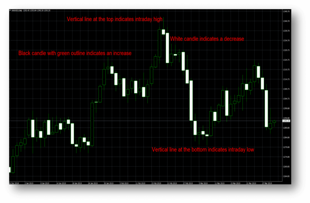
The opening price of a currency pair is represented by the horizontal line at the top or the bottom of a candle, depending on whether the pair is going up or down. It’s the value of a currency pair at the start of a trading session. On a standard candlestick chart, where colours have not been adjusted, a white candle indicates the price is falling. Therefore, the opening price is the horizontal line at the top of the candle. The black and green candle indicates the price is increasing. Therefore, the horizontal line at the bottom of the candle. Please see below chart for reference.
Close price
The close price is indicated by the horizontal line parallel to the opening price line. Again, this is dependant on whether the candle is moving up or down. If it is moving up, the close price is represented by the horizontal line at the top of the candle. Vice versa if the price is going down. The close price is the final value of the currency pair within a 24-hour trading session.
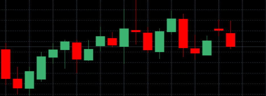
The colour scheme on the candlestick charts can be changed to suit the user’s preference. In the below chart, for example, the red candles indicate a price fall while the green candles indicate a price range.
High and low prices
The vertical lines at each end of the candle represent the highest and the lowest trading values reached throughout the day. The top line – or the wick – being the highest value a currency pair has reached during the session and the bottom line being the lowest value reached.
Direction
Using a pre-set candlestick chart on MetaTrader; a white candle indicates the price is moving down, while a black candle indicates the price is moving up. If you watch the candle long enough, or on a shorter time frame, such as the 5-minute chart (5M), you will actively see the candle moving. You can also compare the candle’s position to the candle from the previous session to determine which direction it is moving.
Range
A range is the price difference between the intraday low and the intraday high, usually represented as a percentage or in pips.
Candlestick chart patterns
Patterns can emerge within a candle itself or a series of candles. Here are some popular candlestick trends you should be aware of.
Single candle formations
A trend can be identified by looking at a single candle. The size of the body and the upper or lower wick can determine whether a reversal pattern is about to start and whether the session is being dominated by sellers or buyers. Here are some trends to be aware of when analysing a chart.
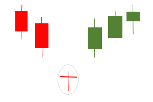
Hammer
A ‘hammer’ candlestick formation is a bullish reversal pattern that appears during a downward trend. When a currency pair is falling in price, a ‘hammer’ suggests the price will start rising. A ‘hammer’ candlestick has a small body and a long bottom wick, with little to no top wick. An example is below:
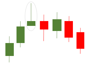
Hanging man
A ‘hanging man’ candlestick is the opposite of a ‘hammer’ but looks very similar. A hanging man indicates a bearish reversal pattern during an upward trend, suggesting the currency pair has reached its high and sellers are about to take control. Again, the body of the candle is small, and the bottom wick is usually twice or three times the size.
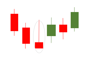
Inverted hammer
Similar to the hammer, an ‘inverted hammer’ indicates a bullish reversal pattern or price change at the end of a downward trend. The inverted hammer is identified by a small body and an extended top wick, where the session’s high is twice or three times the size of the body. There is little to no bottom wick.
Shooting star
A shooting star looks like an inverted hammer, but it appears at the top of an upward trend, indicating a bearish reversal. Like an inverted hammer, it has a long upper wick (or upper shadow) and little to no lower wick. The long upper wick suggests the market tested a resistance level, where bears pushed the price lower.
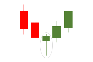
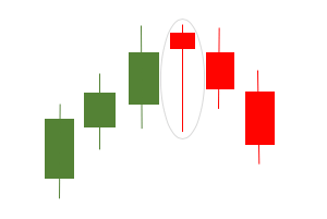
Abandoned baby
An abandoned baby is not as common as the previous candlestick trends discussed. An ‘abandoned baby’ is a bearish reversal pattern at the low of a downward trend. It appears with a market ‘gap’ lower and a narrow trading range (body). The ‘gap’ between candles is caused by selling after-hours or through futures, but once the market reopens, fresh sellers fail to appear. Just like the candle’s name, this trend looks like two larger candles have ‘abandoned’ another, at a lower level.
Bull market
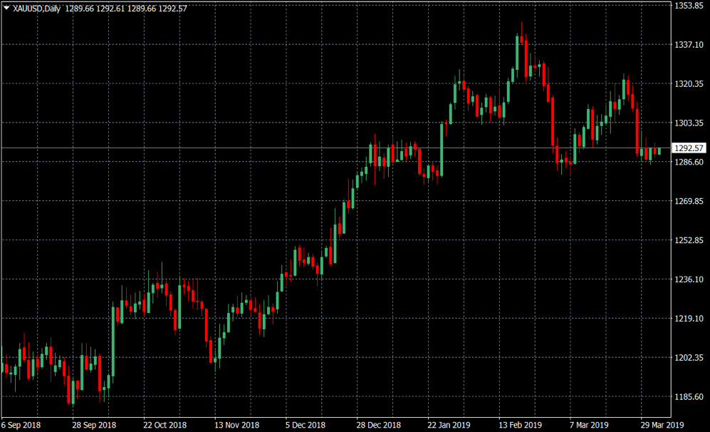
A bull market is a financial market which is increasing in value, encouraged by buyers. It’s usually described as a financial market which rises by 20% in value after a 20% decline and lasts for an extended period of time, whether that’s months or years. A bull market can be identified on a candlestick chart by a series of new ‘higher highs’ and ‘higher lows’. Below is a daily candlestick chart of XAUUSD (gold). You can see the price of gold has been on an upward trend over the last six months. Despite a fall in February, the overall price is trending higher. Therefore, this is a bull market.
Bear market
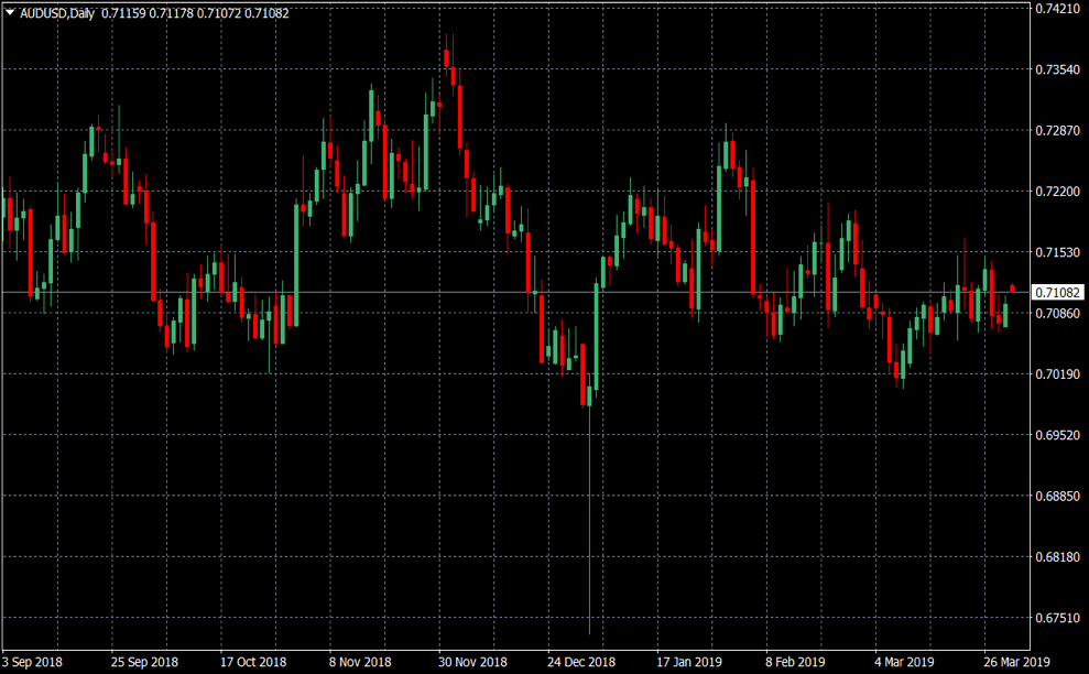
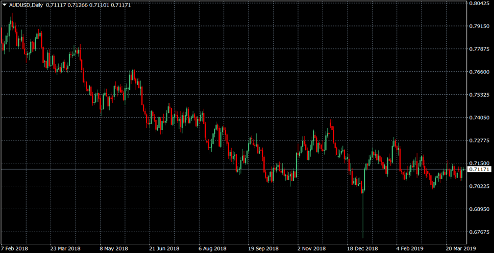
A bear market is the complete opposite of a bull market and can be identified as a 20% decline in a financial market or currency pair, after increasing. In a candlestick chart, a bear market is evident through a series of ‘lower highs’ and ‘lower lows’ over an extended period of time. Below is a candlestick chart of the AUDUSD currency pair for a period of 14 months. The chart shows the AUD slowly declining over the time period, with sellers taking control of the currency pair, therefore revealing a bear market.
Candlestick charts vs other charts
Clients using MetaTrader 4 (MT4) and MetaTrader 5 (MT5) to trade currency pairs have the option of using a candlestick chart, a bar chart or a line chart to identify trends. A line chart does not indicate the daily highs and lows and a bar chart can sometimes be harder to read. Therefore, a candlestick chart is widely regarded as the most popular chart to trade with.
Trading on margin is high risk.