
How to Trade with a MACD Indicator

Components of the MACD Indicator
The MACD line itself indicates the distance between two exponential moving averages, usually a 12-period and a 26- period moving average. To see exactly how it works it helps to plot a MACD indicator along with the 12 and 26 periods moving average it represents, as per the following weekly chart of the AUDUSD pair.
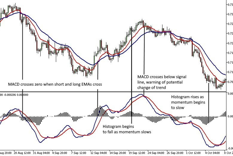
The MACD line, which is blue on this chart, simply tracks the difference between the longer EMA and the shorter EMA. The standard parameters are 12 and 26, though this can be changed to capture different aspects of trend and momentum. When the short EMA crosses above the longer EMA, the MACD line cross from below to above the zero line. The opposite applies when the short EMA crosses below the longer EMA.
The Signal line, which is red on his chart, is an exponential moving average of the MACD line. The default parameter is 9 periods, but this too can be changed. The signal line is added to easily determine when the MACD is rising or falling.
Finally, the Histogram plots the distance between the MACD and Signal lines. The histogram crosses above and below the zero line when the MACD crosses above and below the signal line. Positive price momentum is highest when the histogram is above zero and rising, and negative price momentum is highest when the histogram is below zero and falling.
Using the MACD Indicator
The following are just a few of the many ways the MACD indicator can be used:
Divergence Between Price and MACD
The divergence between peaks and troughs on the price chart and MACD is a very good indicator of pending trend changes or retracements. If the price forms higher highs, while the MACD forms lower highs, there’s a good chance the trend is about to reverse, or meaningful retreatment will occur. The reverse is true during a downtrend; if the price chart forms a lower low, while the MACD forms a higher low, there’s a very good chance of a retracement or a change in trend occurring.
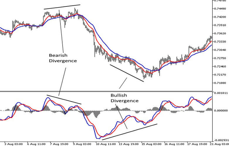
While divergence provides a valuable warning of potential changes in price direction, it does not indicate the magnitude or timing of the potential move. To enter and manage a trade, the price, volume and likely support and resistance levels should also be taken into consideration.
MACD Crossing Zero
When the MACD crosses from below to above zero, the trend may have changed from down to up, and you could now be looking for trades on the long side. When it crosses from above to below zero the trend may have changed from up to down, and you could begin looking for trades on the short side.
Using a MACD as a trend indicator is much the same as using moving averages and will depend on the time frame and the parameters. It’s important to also use other methods such as trend lines, volume and support and resistance levels to confirm the trend.
MACD Crossing Signal
If the MACD is above the zero line and crosses below the signal it can be a sign of slowing momentum or a likely period of consolidation. This can offer new opportunities to enter long trades if the trend begins to resume, or to tighten stops if support does not hold. The reverse applies to bearish trends with the MACD below the zero line.
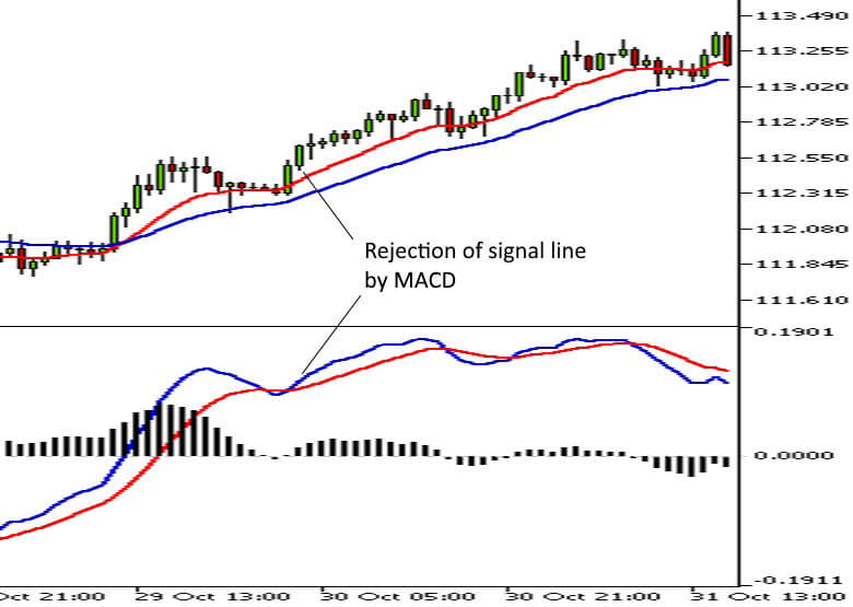
Rejection of The Signal line
Sometimes the MACD indicator will briefly approach, touch or cross the signal line before moving sharply higher (in a rising market) or lower (in a falling market.) This often provides a good opportunity for short term momentum trades in the direction of the trend. The 60-Minute USDJPY chart below shows a good example of this.
Using the Histogram as a Momentum Indicator
If you look at any chart with a MACD, you will notice that price momentum is highest when the histogram is in positive territory and rising. The opposite applies when prices are falling, with the histogram below zero and falling.
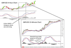
By looking at multiple time frames, traders can use longer timeframes to identify momentum and then use shorter timeframes to find trades in the direction of momentum. The charts below show the same period on a 4-Hour and 15-Minute chart of the GBPUSD pair. Focussing on long trades on the 15-minute chart while the MACD histogram on the longer time frame is rising means you know you are trading in the direction of longer-term momentum.
Conclusion
As you can see there are several ways to use the MACD indicator. It can be used for any market and on any time frame. It’s also a useful indicator to use to quickly scan multiple charts to quickly identify potential trading opportunities.
As with any indicator, it’s important to use other indicators or price and volume action to give context and confirmation to potential trades.